Remy Usman is a visual designer, currently at GoGuardian.
Recent Work
Archives
︎︎︎ Charcoal Magazine

BRANDING, VISUAL IDENTITY & DESIGN
Peary’s New Look
Pear Deck Learning's newly-consolidated product suite needed a new look to transform their collection of education tools into a comprehensive learning ecosystem. Building upon Koto Studio’s refined Pear Deck logo and mascot, we crafted a flexible visual identity that reflects the diverse tools catering to every stage of the K–12 learning journey.
Creative Director: James King
Visual Designers: Myself, Katie Krull
Creative Director: James King
Visual Designers: Myself, Katie Krull


EDUCATE, ENGAGE, INSPIRE
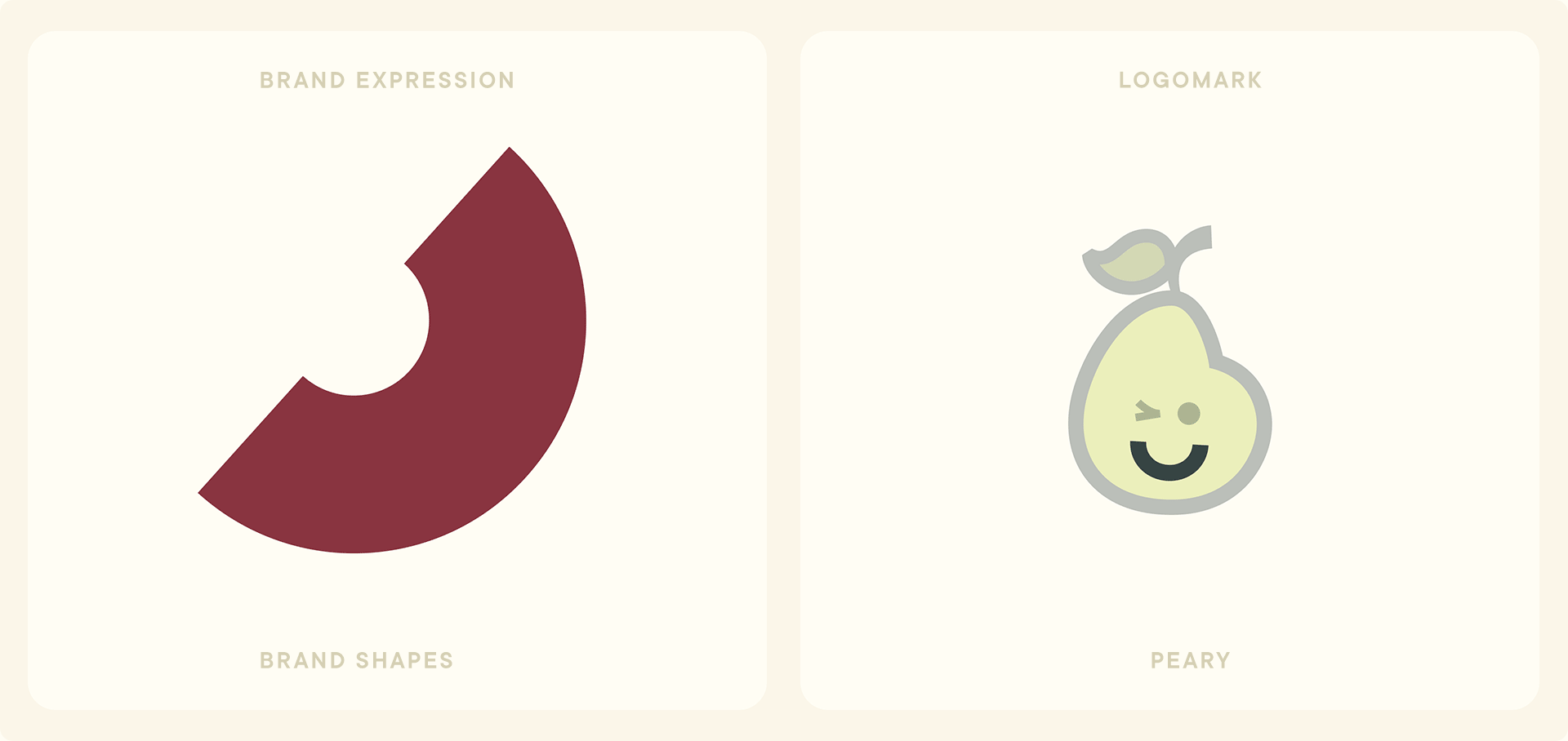
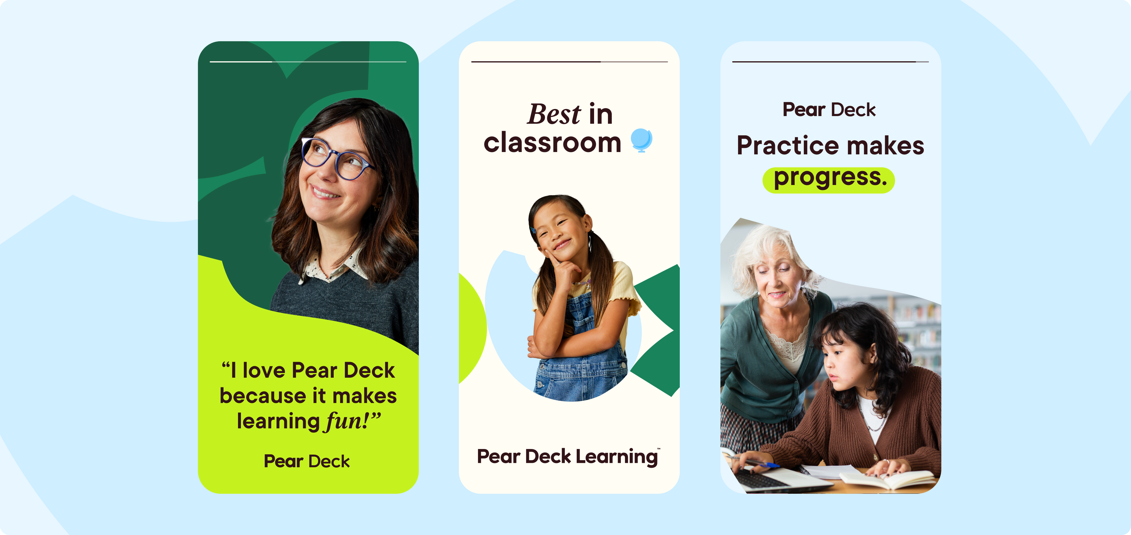
To unify this suite of curriculum and instruction tools, we anchored our key graphic in the brand recognition of 'Peary'—Pear Deck’s original logomark and mascot. Additional motifs draw inspiration from moments of connection in the classroom (expressed through overlayed shapes), playful typography that seamlessly adapts to differences in tone and audience, and a color palette reminiscent of the brand's fruitful origins.
To unify this suite of curriculum and instruction tools, we anchored our key graphic in the brand recognition of 'Peary'—Pear Deck’s original logomark and mascot. Additional motifs draw inspiration from moments of connection in the classroom (expressed through overlayed shapes), playful typography that seamlessly adapts to differences in tone and audience, and a color palette reminiscent of the brand's fruitful origins.


BRAND SHAPES SUBHEAD
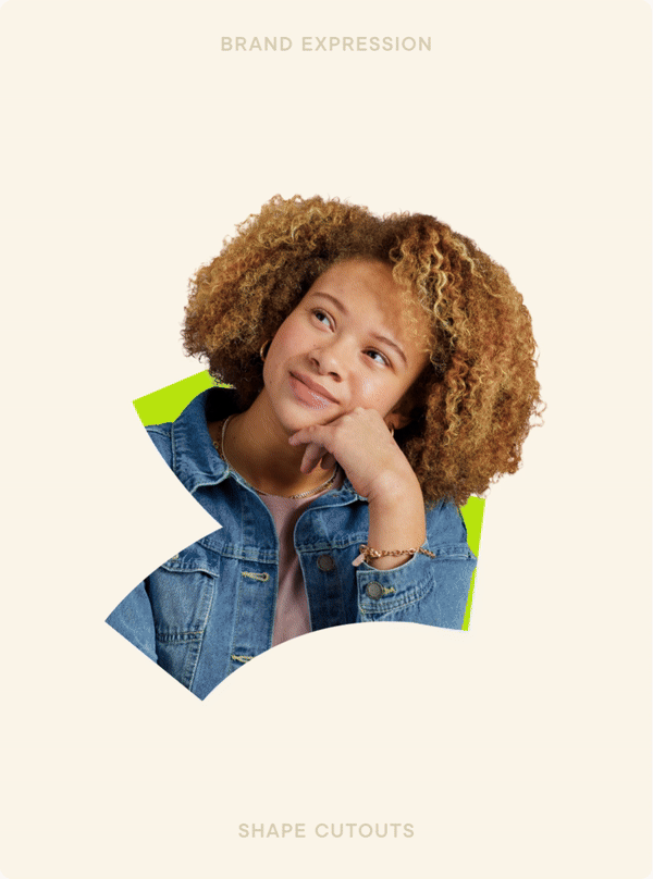
Our visual identity caters to diverse tones, audiences, and offerings, maintaining a delightful and distinct voice throughout. Geometric cutouts and shapes pull directly from Peary’s new look—the leaf symbolizing growth, the smile evoking the joys of learning—serving as illustrative elements, container shapes for imagery, and structural components across web and email layouts.
Our visual identity caters to diverse tones, audiences, and offerings, maintaining a delightful and distinct voice throughout. Geometric cutouts and shapes pull directly from Peary’s new look—the leaf symbolizing growth, the smile evoking the joys of learning—serving as illustrative elements, container shapes for imagery, and structural components across web and email layouts.


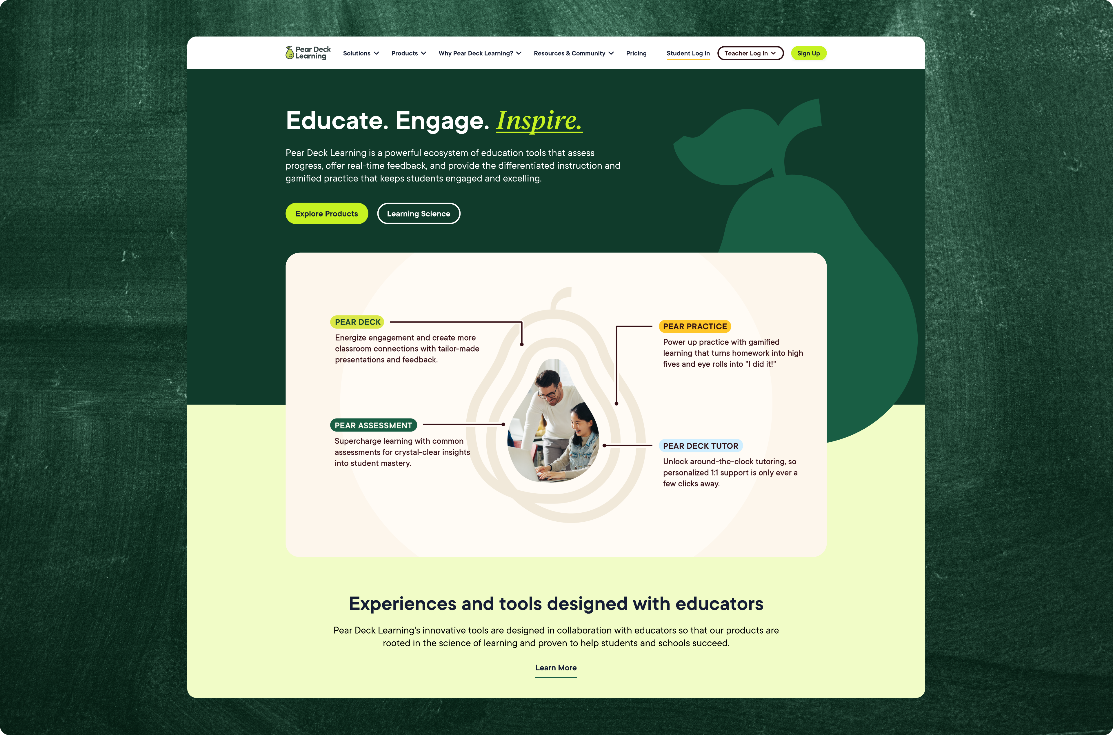
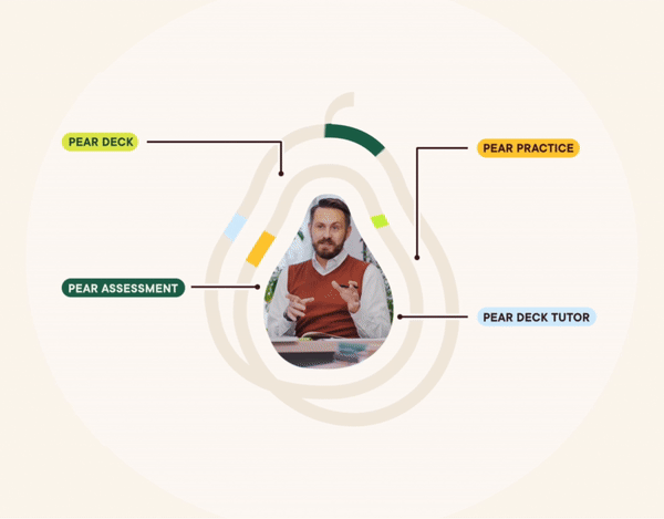
OUR LEARNING ECOSYSTEM
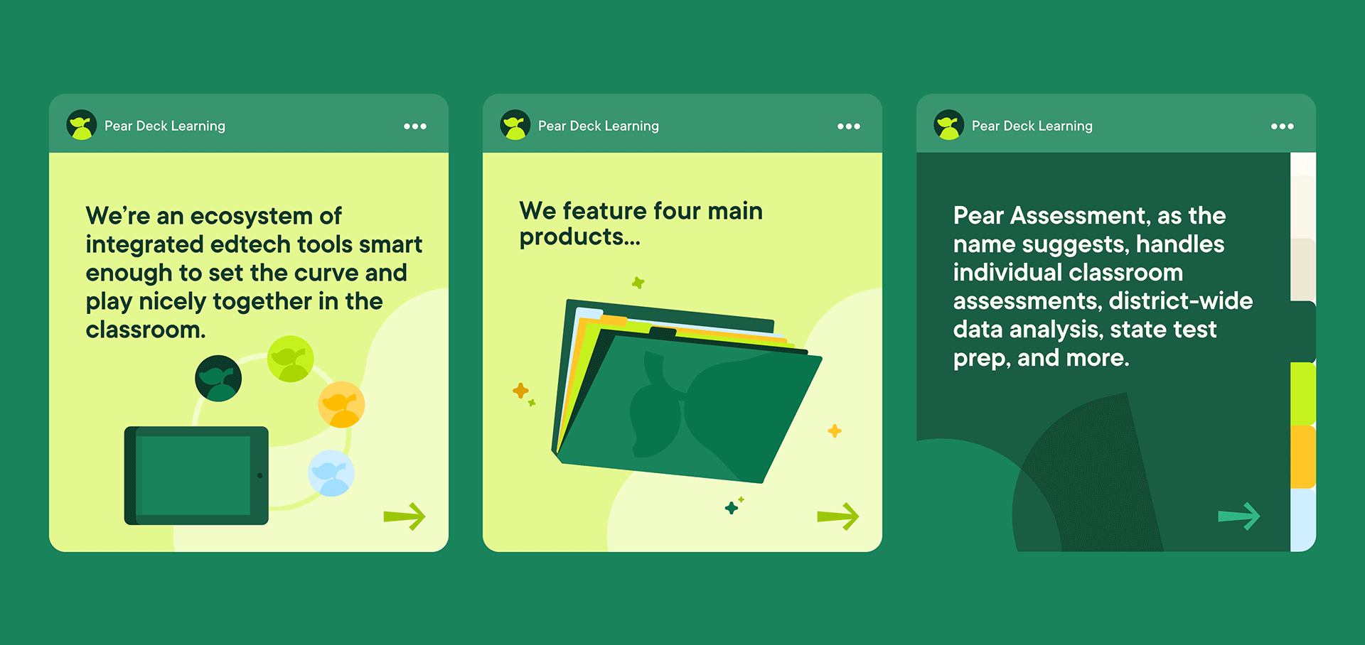
To illustrate Pear Deck Learning's C&I lineup, I took on the challenge of creating an eye-catching ecosystem graphic. After some creative exploration, the selected design spotlights student-teacher connection and hints at endless possibilities within the product suite. The talented Rico Shackleford set the graphic in motion, breathing life into the thematic representation.
To illustrate Pear Deck Learning's C&I lineup, I took on the challenge of creating an eye-catching ecosystem graphic. After some creative exploration, the selected design spotlights student-teacher connection and hints at endless possibilities within the product suite. The talented Rico Shackleford set the graphic in motion, breathing life into the thematic representation.

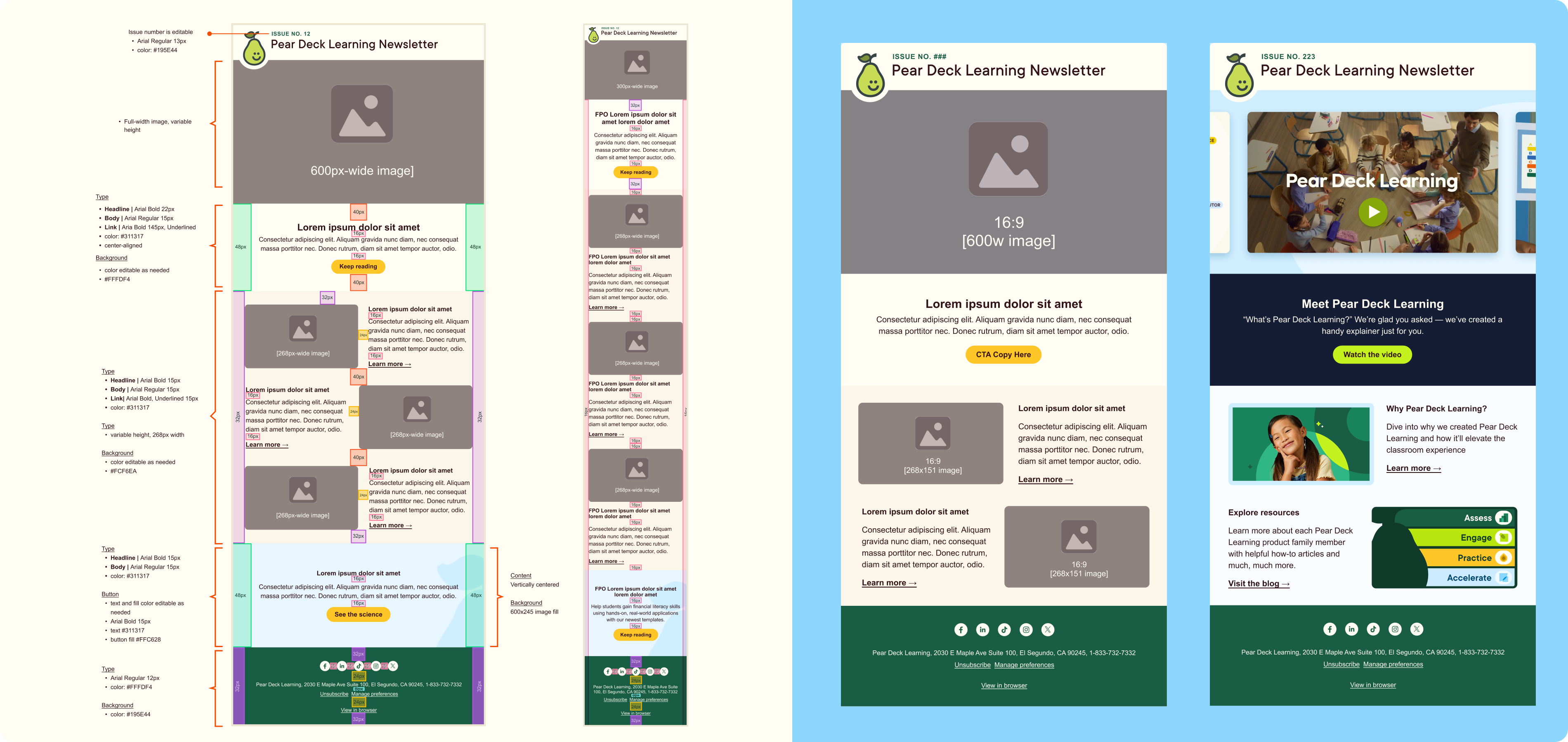
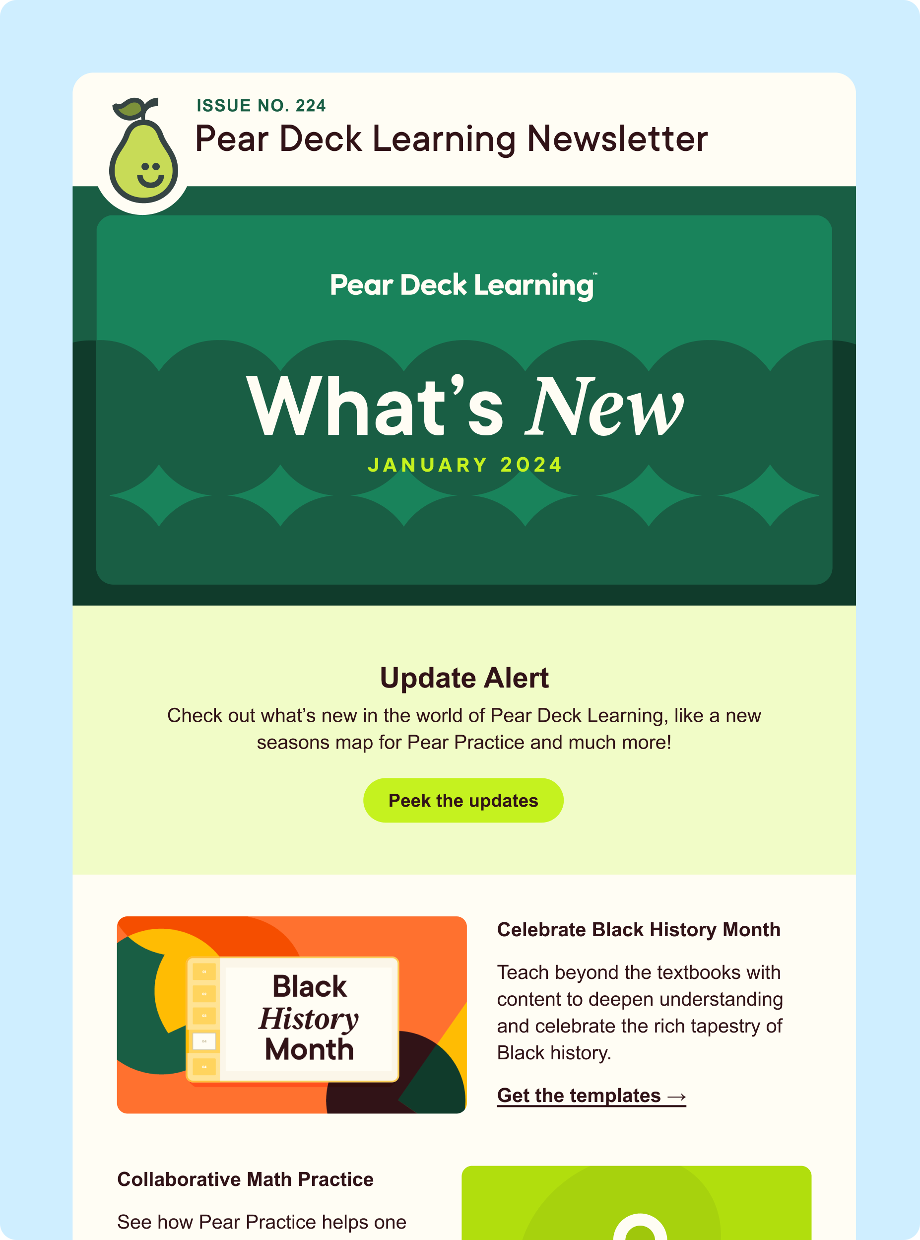
A NEWSLETTER FOR MILLIONS
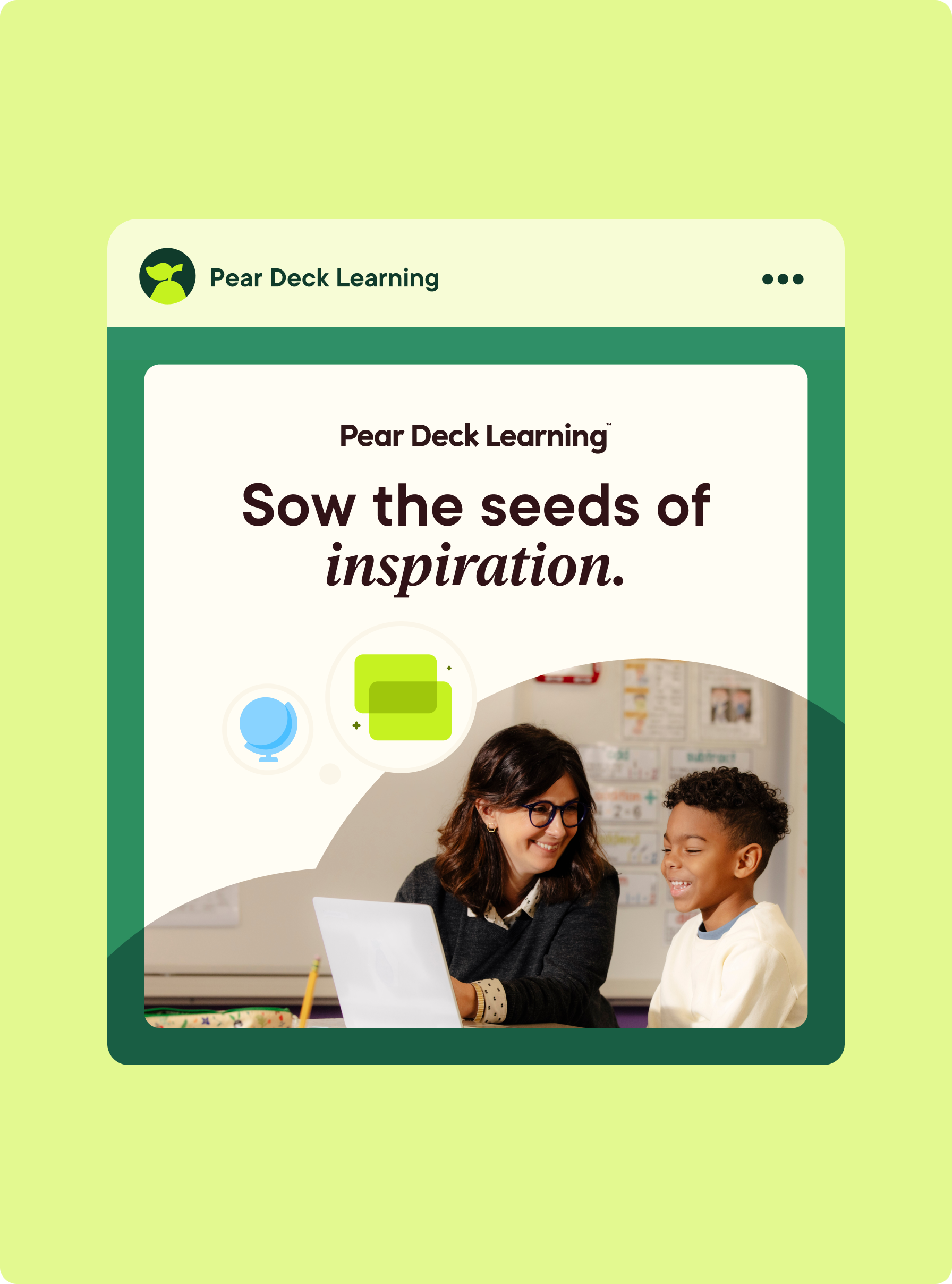
With flexibility in mind, I developed a newsletter template for Pear Deck Learning's readership of over 1 million subscribers. Differing from previous newsletters, our aim was to effortlessly incorporate or remove content sections, allow color customization throughout the email, and streamline newsletter creation with 16:9 imagery. Staying consistent with prior Pear Deck newsletters Peary sits along the top, now in a left-aligned position proudly displaying the latest issue edition.
With flexibility in mind, I developed a newsletter template for Pear Deck Learning's readership of over 1 million subscribers. Differing from previous newsletters, our aim was to effortlessly incorporate or remove content sections, allow color customization throughout the email, and streamline newsletter creation with 16:9 imagery. Staying consistent with prior Pear Deck newsletters Peary sits along the top, now in a left-aligned position proudly displaying the latest issue edition.